
UCLA Mobile Order
UI_UX REDESIGN | MOBILE APP
Making campus food ordering easier, faster & more transparent — an independent UX/UI redesign of UCLA's existing mobile ordering app.
Role
- UI_UX Designer
Timeline
- August – September 2026
- (7 weeks)
Tools
- Figma
- FigJam
- Adobe Illustrator
- Anthropic Claude AI
UX Audit
I conducted an initial UX audit of the existing UCLA mobile app, examining its navigation, food discovery, ordering, and pickup experience. I identified several areas where the app could better support students, particularly those ordering between classes or during limited breaks.
My initial observations revealed three key areas for improvement: discoverability, pickup uncertainty, and menu transparency.
Discoverability & Navigation
Finding nearby dining options, filtering menus, and accessing quick reorder could be more intuitive.
Ordering & Pickup Uncertainty
Limited pickup directions, unclear wait times, and QR code usability could create friction during order collection.
Menu Transparency
Limited food previews, ingredient information, and dietary details could make it difficult for students to make informed choices.
These findings helped me identify opportunities to improve the existing experience without introducing an entirely new platform.
User Interviews
To better understand students' experiences with UCLA's existing mobile ordering app, I conducted in-person interviews with 10 UCLA students along Bruin Walk. I approached students at random to gather perspectives from a range of campus diners and learn about their experiences with mobile food ordering.
The goal was to uncover pain points throughout the ordering journey, from discovering dining options to picking up meals, and identify opportunities to make the app more intuitive, efficient, and transparent.
Interview Process
I used a semi-structured interview approach, asking students about their campus dining habits, experiences with the UCLA mobile ordering app, and challenges they encountered when placing or picking up orders.
- 1
On-Campus Interviews
I approached 10 students on Bruin Walk and asked open-ended questions about their campus dining routines, mobile ordering habits, and familiarity with the UCLA app.
- 2
Pain Point Exploration
I asked follow-up questions about students' experiences with food discovery, menu navigation, order tracking, and pickup. Their responses helped me explore frustrations, expectations, and areas where the existing app could be improved.
- 3
Synthesizing Insights
After the interviews, I reviewed and grouped students' feedback to identify recurring pain points and common needs. These findings helped me inform the direction of my redesign and prioritize opportunities for improvement.
Key Research Insights
01EfficiencyStudents want a faster way to reorder familiar meals.
+
Students want a faster way to reorder familiar meals.
Students with busy schedules value convenience and want to spend less time navigating menus when ordering their usual meals.
"If I'm ordering the same thing I always get, I wish I didn't have to go through the whole menu again."
Design opportunity: Make recent orders and favorites accessible directly from the home screen through Quick Reorder.
02Pickup ExperienceStudents need more clarity around order pickup.
+
Students need more clarity around order pickup.
Uncertainty around order readiness, wait times, and pickup locations can make it harder to coordinate food orders with a busy campus schedule.
"Sometimes I don't know exactly where I'm supposed to pick up my order or if it's even ready yet."
Design opportunity: Provide visible order status, estimated readiness, and clear pickup directions within the active order screen.
03Menu TransparencyStudents want to know more before placing an order.
+
Students want to know more before placing an order.
Menu names alone may not provide enough context for students to confidently choose a meal, especially when considering ingredients or dietary preferences.
"I want to see what the food actually looks like and what's in it before I order."
Design opportunity: Introduce food previews, ingredient details, and dietary information to support more informed ordering decisions.
04Food DiscoveryFinding convenient dining options should be simple.
+
Finding convenient dining options should be simple.
Students may need to choose where to eat based on their location, schedule, and food preferences. Streamlined discovery can help them narrow down relevant options.
"If I only have a little time between classes, I want to find somewhere nearby without clicking through so many things."
Design opportunity: Add location-based dining discovery and filters to help students find relevant options more efficiently.
Names omitted for privacy — quotes lightly edited for clarity.
Target User
The UCLA Mobile Order App is designed for students who want to order food on campus conveniently, especially between classes, during short breaks, or while navigating a busy academic schedule.
The target user profile combines student demographics, campus dining behaviors, and the needs identified through the redesign's UX audit and interviews with 10 UCLA students on Bruin Walk.
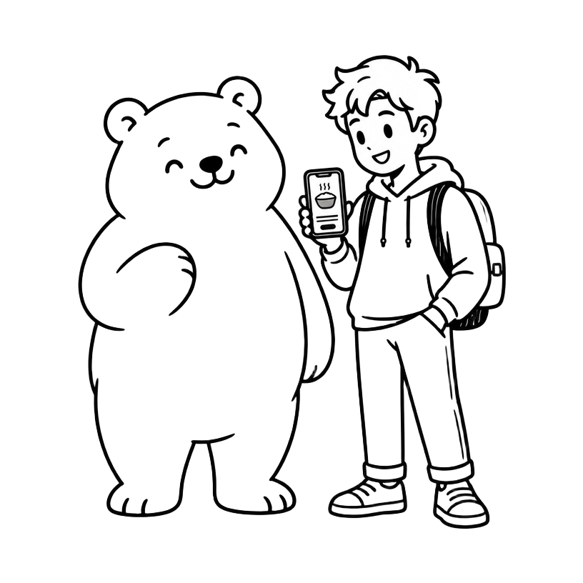
Primary Target User
The Busy Bruin
UCLA Undergraduate Student
A student balancing classes, extracurriculars, and social activities who values convenient, reliable, and time-efficient campus dining.
Age range
18–24*
Primary device
Smartphone
Location
UCLA, Westwood
Key priority
Saving time
*Age range is a proposed persona assumption, not a verified statistic from the 10 interviews.
Goals, Needs & Pain Points
Goals
+
- Find food quickly between classes
- Reorder favorite meals with minimal steps
- Know exactly when and where to pick up food
- Make confident food choices
Needs
+
- Intuitive navigation and nearby dining options
- Accurate pickup estimates and clear directions
- Convenient access to recent orders
- Transparent menus with ingredients and dietary details
Pain Points
+
- Difficulty discovering and filtering dining options
- Quick reorder is buried in navigation
- Unclear pickup status and location instructions
- QR code scanning requires manually adjusting brightness
- Limited food previews and allergy-related information
Key Takeaway
The target user is a time-conscious UCLA student who needs a seamless mobile ordering experience that fits into a busy campus routine. The redesign should prioritize efficient food discovery, clear pickup guidance, and transparent menu information to reduce friction from browsing to pickup.
Problem Statement
UCLA's existing mobile ordering app provides students with a convenient way to order food on campus, but gaps in navigation, pickup information, and menu transparency can create friction throughout the experience.
Students need a more intuitive way to discover dining options, reorder their favorites, locate pickup counters, and make informed food choices, particularly when ordering between classes.
Define & Prioritize
After identifying recurring pain points through my initial UX audit and student interviews, I translated the findings into potential design solutions. I prioritized features based on their relevance to the ordering experience, potential user impact, and feasibility within the scope of this independent redesign.
The goal was to address the most prominent friction points while maintaining the familiarity of UCLA's existing mobile app.
Prioritization Matrix
| Priority | Feature | Description |
|---|---|---|
| P1High priority | Pickup guidance & order status | Reduce uncertainty when collecting orders through clearer pickup locations, status updates, and QR code access. |
| P1High priority | Quick reorder | Make repeat purchases easier by bringing recent orders and favorites closer to the home screen. |
| P1High priority | Menu transparency | Help students make informed food choices with accessible food previews, ingredients, and dietary information. |
| P2Medium priority | Dining discovery & filters | Improve browsing through location-based discovery and filters for relevant dining options. |
| P2Medium priority | Pickup time estimates | Make wait-time information easier to understand and more useful when comparing dining options. |
Interactive Prototype
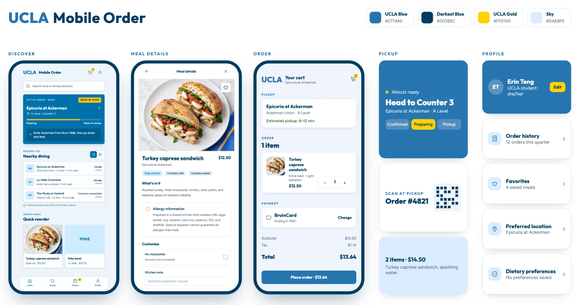
The interactive prototype below brings the redesigned UCLA Mobile Order experience to life. Tap through the home screen, search for food, browse nearby dining locations, open a meal detail, place an order, and track pickup — all in a self-contained demo built with the design system outlined below.
Around you
Quick reorder
User Flow
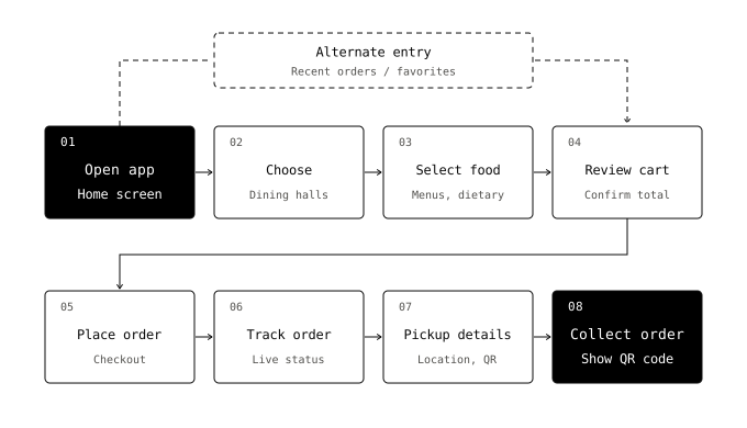
I mapped out a simplified end-to-end ordering journey to understand how students could move from opening the app to picking up their food. The flow emphasizes reducing unnecessary navigation, making key information easier to access, and providing clearer guidance throughout the experience.
Design System
To create a cohesive and intuitive mobile experience, I focused on establishing a consistent visual language across the redesigned screens. The design system supports readability, clear navigation, and recognizable interactions while maintaining a connection to UCLA's existing brand identity.
Typography
Outfit
Headings — titles, the UCLA wordmark, section headers, prices. Outfit's geometric, rounded feel carries the brand identity.
Figtree
Body text — lists, labels, and descriptions kept easy to read at small mobile sizes. Both loaded from Google Fonts.
Color Palette
UCLA Blue
#2774AEPrimary — buttons, active nav, links, map pins.
Darker Blue
#003B5CPressed states and the dark text on gold.
UCLA Gold
#FFD100Accents only — reserved for pickup urgency (badges, "ready" status, cart count).
White
#FFFFFFCard surfaces and page background.
Light Gray / Soft Blue
#E5E5E5Dividers, chips, and the soft-tinted location tags (#DCEDF5).
Information Hierarchy
Information hierarchy of the app, top to bottom, based on what gets visual priority:
Home screen
+
- Search bar — topmost, grows and gains a blue border when you type, because finding food comes first.
- Active order card ("READY IN ~4 MIN", Counter 3) — the only gold-accented, most prominent card, since the most time-sensitive thing is knowing when and where to pick up. Includes walking directions and a live progress bar.
- Nearby dining — the discovery layer: cards with walking time and pickup estimate, list/map toggle.
- Quick reorder — smallest section at the bottom, small meal cards, because it's a convenience, not the main path.
- Bottom nav — always visible, fixed: Home, Dining, Orders (gold "1" badge), Profile.
Dining tab
+
- Dining locations first (where to go outranks what to eat), then meals below.
- Detail panels (food, location, pickup) slide up over everything, so context is never lost — close and you're back where you were.
Logic
The logic throughout: urgency → discovery → convenience. Gold is reserved strictly for things that need action now (pickup status, cart badge, edit button); blue handles navigation and links; everything else stays neutral so the urgent item is instantly scannable.
Outcomes
Through the redesign, I translated the initial UX audit and student interview findings into a more structured mobile ordering experience. The proposed solutions focus on reducing friction across the student journey, from discovering food to picking up an order.
01Streamlined Food Discovery
+
Streamlined Food Discovery
A clearer approach to browsing dining options, filtering menus, and accessing recent orders.
02Improved Pickup Visibility
+
Improved Pickup Visibility
A more actionable pickup experience that prioritizes order status, location details, and QR code access.
03More Transparent Menu Information
+
More Transparent Menu Information
A design direction that brings food details and dietary information closer to the ordering decision.
04A More Consistent Mobile Experience
+
A More Consistent Mobile Experience
A cohesive visual system and clearer information hierarchy across the redesigned interface.
Future Opportunities
While the redesign addresses several key friction points identified during the initial research, there are opportunities to further develop and validate the experience.
01ValidateConduct Usability Testing
+
Conduct Usability Testing
Test the interactive prototype with UCLA students to evaluate how easily they can discover food, reorder meals, and complete pickup. Use their feedback to identify usability issues and refine the design.
02RefineImprove Personalization & Dietary Support
+
Improve Personalization & Dietary Support
Explore saved dietary preferences, favorite dining locations, and personalized recommendations to make the experience more relevant to individual students.
03EvaluateMeasure the Impact
+
Measure the Impact
If implemented, evaluate task completion rates, time to reorder, pickup-related confusion, and student satisfaction to understand whether the redesign delivers meaningful improvements.
04ExploreConsider Technical Feasibility & Accessibility
+
Consider Technical Feasibility & Accessibility
Assess integration with UCLA Dining's existing systems, including real-time pickup estimates, location data, QR code behavior, and accessible interface patterns.
Reflection
This project allowed me to approach a familiar campus experience through a UX design lens, moving beyond visual improvements to consider how students interact with the app in their everyday routines.
By conducting student interviews and evaluating the existing experience, I developed a clearer understanding of how seemingly small usability issues can create friction across an entire user journey. It also reinforced the importance of connecting design decisions to user needs, while recognizing that further testing is necessary to validate proposed solutions.
The next step would be to test and refine the redesigned experience with students, ensuring that the final solution is not only visually cohesive but also intuitive, accessible, and practical for everyday campus dining.