
nook
CONCEPT UI_UX DESIGN | LOGO DESIGN
A café discovery concept app that helps students and working professionals find productive spaces easier!
Role
- UI_UX Designer
- Logo Designer
Timeline
- June – August 2026
- (2.5 months)
Tools
- Figma
- FigJam
- Adobe Photoshop
- Adobe Illustrator
The Problem
Ratings tell you the coffee is good. Not whether you can work there.
Students and remote workers pick a café by star rating, then find out the real problems after they've already ordered: no outlets, no seats, music too loud to focus through. Not to mention: some cafés aren’t exactly work or study-friendly. As a result, students often visit multiple cafés before finding one suitable for studying, wasting time and creating unnecessary frustration.
So, the question forms: How can we help students and working professionals quickly discover cafés that support the way they work, not just where they eat or drink?
User Research
To better understand how people choose study and work spaces, I interviewed 3 students and 3 remote workers who regularly visit cafés throughout the week, particularly for the intent to be productive.
- Learn where or how users currently search for cafés
- Identify what influences their decision
- Identify pain points with existing platforms
- Discover opportunities to improve the experience
Primary Research
I recruited 8 participants (6 students and 2 working professionals from across California). I conducted my research through a combination of Google Forms surveys and short phone interviews, allowing me to gather more detailed qualitative insights.
Users don't struggle to find cafés. They struggle to determine whether a café will support the way they want to work!
- 7 of 8 participants searched using Google Maps.
- 6 of those 7 also checked Yelp before deciding.
- All participants who used review platforms said it took too long to find information about noise, outlets, and Wi-Fi.
- 3 of 8 participants purchased something before realizing the café wasn't suitable, resulting in wasted money.
- Every participant said the environment ultimately determined whether they stayed.
Secondary Research
According to the Federal Reserve's 2025 Report on the Economic Well-Being of U.S. Households:
This highlights a growing population that regularly seeks productive workspaces outside of traditional offices. Industry observations also show cafés increasingly functioning as "third places" where people work outside the home or office. However, most review platforms continue to prioritize dining experiences over productivity, leaving users without the information they need to confidently choose a workspace.
The Solution
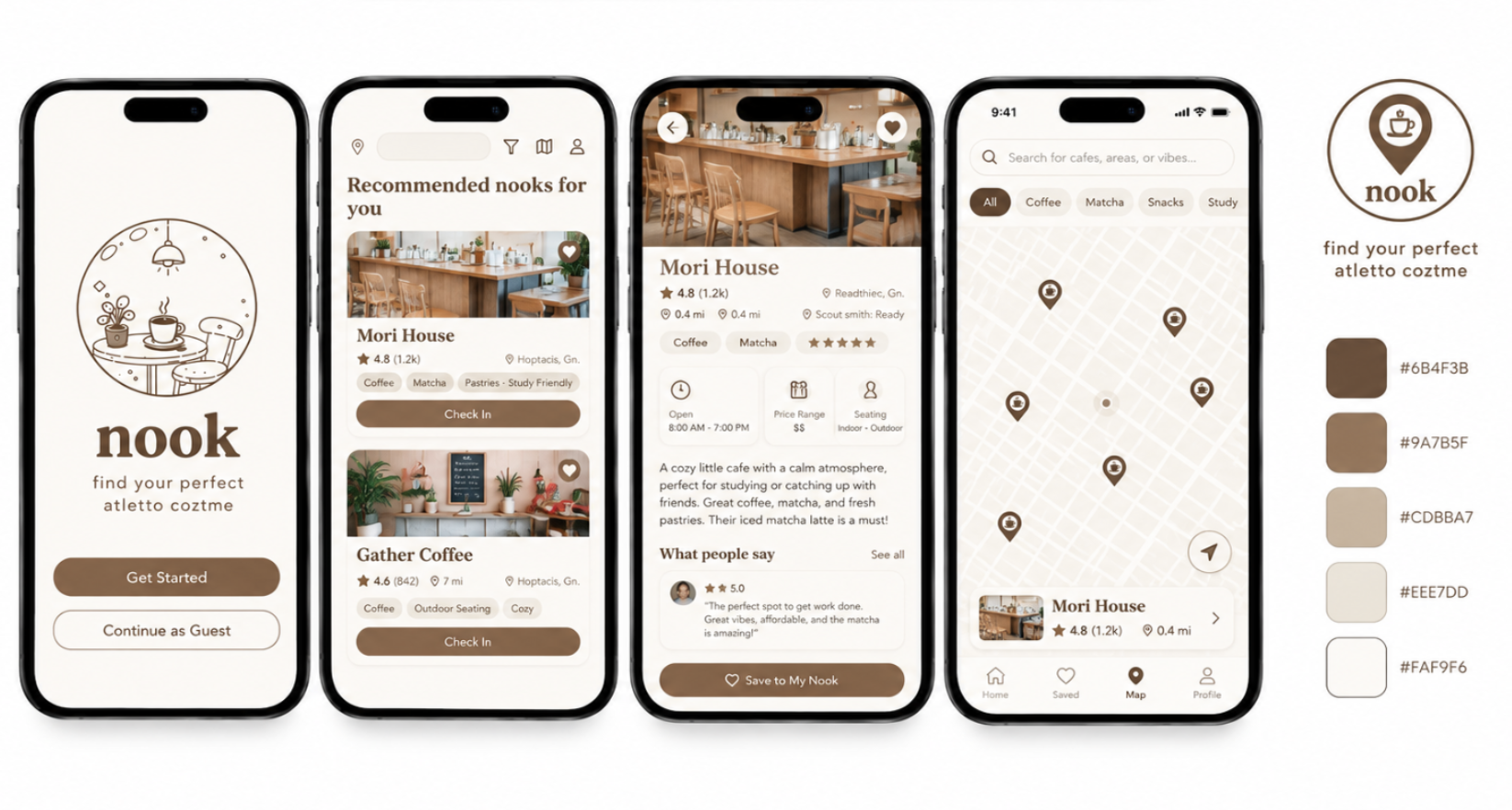
nook helps users discover cafés based on productivity rather than popularity. Instead of emphasizing food and drink ratings, the experience highlights environmental factors that directly impact focus and comfort.
Reviews highlight: noise level, Wi-Fi, outlets, seating, lighting, crowdedness. Quick filters help users narrow results based on the way they work instead of generic restaurant categories.
Logo Design
- Location Pin: Represents exploration, discovery, and finding the right destination.
- Coffee Cup: Symbolizes cafés as welcoming spaces for studying, working, and connecting.
- Combined Mark: Merges location and coffee into one simple, memorable icon that scales well across the app, maps, and branding.
- Warm Brown Palette: Inspired by coffee, wood, and cozy interiors to create a sense of comfort and focus.
Design Systems
nook's visual language was designed to feel warm, approachable, and calm. Every design element, from typography to button hierarchy, reinforces the feeling of settling into a comfortable space where users can focus.
Typography
A classic serif typeface is used for headings to evoke warmth and familiarity, reflecting the inviting atmosphere of neighborhood cafés. A monospaced typeface complements it by presenting supporting information such as addresses, hours, and café details in a clean, structured way.
Information Hierarchy
Café cards are organized to prioritize the information users identified as most valuable during research. Large imagery provides immediate context, while the café name, work score, and productivity highlights are surfaced before secondary details such as food ratings or descriptions.
Button / CTA Hierarchy
Primary actions, such as Find Your Nook and Check In, are displayed using filled buttons to clearly guide users through key tasks. Secondary actions, like Skip or Contact, use outlined buttons to remain accessible without competing for attention.
Color Palette
I chose a warm, neutral palette drawn from the coffee shop environment itself: camel, blush cream, espresso brown, and soft white. Espresso brown anchors headlines, primary buttons, and star ratings, camel marks selected filters, icons, and secondary tags, and cream and white structure the cards and backgrounds. Tan is reserved for larger elements like pins, borders, and unselected filter chips to preserve contrast, keeping all body text and key actions in espresso brown for accessibility and clear visual hierarchy across onboarding, browsing, and check-in flows.
The Outcomes
nook reimagines café discovery by helping users evaluate spaces based on the factors that matter most for productivity. Rather than relying on generic restaurant reviews, users can quickly compare cafés through study-focused information like noise level, Wi-Fi reliability, outlet availability, and seating.
- Faster decision making through clear, scannable café cards and productivity-focused filters.
- More relevant information by highlighting the environmental factors users identified during research.
- A community-driven experience through check-ins that keep café information current and useful for future visitors.
Future Revisions
If I continued developing nook, I would expand the experience with features that build on the existing concept.
- Continue developing user profiles
- Continue developing the onboarding process
- Expanded filters (accessibility, parking availability, pet-friendly spaces, meeting rooms, and food preferences) to serve a wider range of users