
driveLY
CONCEPT UI_UX DESIGN | LOGO DESIGN
A two-sided marketplace that makes booking certified driving instructors simple, transparent, and stress-free.
Role
- UI_UX Designer
- Logo Designer
Timeline
- March – April 2026
- (1.5 months)
Tools
- Figma
- Canva
- Adobe Photoshop
- Adobe Illustrator
The Problem
Learner drivers and their parents face a fragmented, opaque market. Instructors are found through word-of-mouth or generic directories that reveal almost nothing about fit, availability, or price transparency.
“I spend so much time jumping through different messaging apps and just figuring out if someone's free. By the time we sort a slot, most prospective clients have already gone with someone else.”
“My friend had a completely different instructor and paid way less than me. I didn't even know prices could vary that much.”
“Between work, school, and everything else, finding a lesson time that works for our family is harder than it should be.”
Names omitted for privacy — quotes lightly edited for clarity.
Two Sides of the Same Road
01
The Instructor
- Loses clients during slow reply windows
- No central tool! Scattered across apps or websites
- Can't build a reputation online
02
The Learner / Parent
- Anxious about safety and qualification
- Overwhelmed by lack of structure
- No way to compare instructors side by side
The Solution
I designed driveLY, a two-sided platform that simplifies how learner drivers find and book instructors while helping instructors manage availability, scheduling, and student communication in one place.
The Logo
I wanted the driveLY brand to feel like moving forward, not just learning to drive. I built the logo around the idea of a journey, transforming the “d” into a curved road with lane markings to subtly bring the driving experience into the wordmark. The italicized typography reinforces speed and momentum, while the red accents add energy and confidence.
Design Systems
Typography
A clean sans-serif body for maximum legibility, while headlines use a deliberate weight shift to create hierarchy without introducing a second typeface. A single word per headline, the emotional keyword, is set in italic to add warmth and intent without breaking the system.
Button / CTA Hierarchy
Every primary action is a solid crimson button. Every secondary action is ghost/outline. The rule is absolute: one filled button per screen, never two. This removes decision fatigue at the exact moment a user needs to act.
Trust signals
Language filters for accessibility. Lesson count and years of experience show track record.
The Booking Flow — five steps, zero abandoned stages
- 1
Land & Search
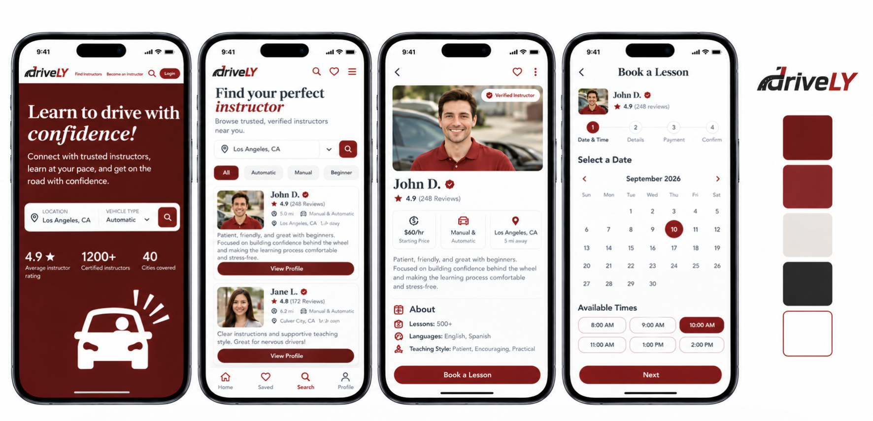
The homepage hero collapses the entire discovery intent into two fields and one red CTA: location (city or ZIP) and vehicle type (automatic or manual), with auto-detect location.
- 2
Filter & Browse
Narrow results by what actually matters to learners and parents: price, language, teaching style, reviews. Browse by rating or top picks, and results update instantly.
- 3
Review Profiles
The profile cards have everything needed to decide. No calls or back-and-forth needed!
- 4
Pick a Slot
A live, real-time calendar in the learner’s local timezone that reserves slots for 10 minutes during checkout. Gray slots are unavailable, white slots are bookable.
- 5
Pay & Confirm
PayPal, manual card entry or Google Pay, a full price breakdown before committing, and instant confirmation with instructor, contact details, date and meeting information. A calendar invite is sent automatically.
Before & After
Booking
BeforeFrom forms submitted by email or text with confirmation taking days
AfterA live in-app calendar showing real availability in the learner’s timezone, confirmed instantly.
Discovery
BeforeFrom a generic directory listing with a phone number
AfterPrice, lesson count, star rating, specialty tags and spoken languages directly on each profile card.
Payment
BeforeFrom cash on the day or bank transfer after
AfterCard, PayPal, or Google Pay at checkout.
Trust
BeforeFrom no way to verify credentials
AfterCertification badges, verified reviews, experience, student count and bio all visible before booking.
Outcomes
By introducing transparent profiles and integrated booking tools, the platform reduces manual coordination and streamlines lesson booking for both user groups.
Trust-first architecture
Reviews, ratings, credentials, and student count reduce cold-start anxiety before a single dollar is spent
Language filtering unlocks under-served multilingual communities
Speakers can find a match in seconds instead of calling five people
Instructor profiles double as product pages
Building personal brand within the platform encourages repeat bookings and referrals
Multi-payment options
Eliminates the awkward cash conversation and reduces final-step abandonment
Real-time availability calendar
Removes the #1 drop-off point — the asynchronous scheduling loop is gone entirely